.jpg)
Our rental kitchen is still a work in progress. Until it is completed I won’t be giving a full reveal, but I did want to share my progress because I am really happy with this rental-friendly update that I did to the back splashes and one of the counters this spring. I was happy that the cabinets, although all three sets are different, are all painted white. I do like a simple white kitchen, especially old wooden cabinets. My dream kitchen is actually quite similar to this one, but with a better layout (for example, the stove is against a completely different wall so cooking can be a bit difficult when I’m carrying ingredients or hot cookware across the kitchen) and butcher block counters. I could also do without the vinyl floors that have been covered up with brown paint that is peeling off and sticks to my feet. But all in all, this is a nice rental kitchen. It is spacious with plenty of cabinets and there are three windows so I love all the natural light.
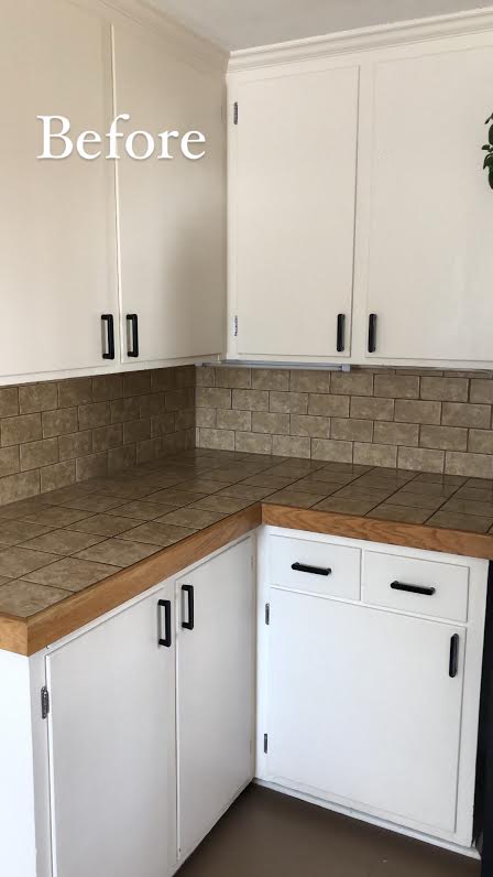
I shared all my plans for this rental kitchen in this blog post here. Because it is a rental I cannot change much and all changes I do make are easily removable. The big one for me was covering up the beige-brown tiles that make up the back splash and the counters. They weren’t exactly bad, but they were dirty looking and they made the kitchen appear dated and darker.

At first I planned on using tile stickers, but they were expensive and they didn’t fit the rectangular tiles in the back. So I found a great contact paper that looked like old Italian blue tiles. I will share more information about the contact paper when I make the final kitchen reveal. It took about an hour to install this corner evenly and some trial and error, but we got the hang of it and the back splash behind our sink only took thirty minutes. The best part is that they look completely real (I had some uncertainty about it looking fake and my worries were for naught) and they are also easily wipe-able so I can prepare meals on them just fine. And they peel off easily with no residue left behind.
.jpg)
.jpg)
I was really impressed with the final result and my skeptical husband was very happy too! We both love our new kitchen back splash and counter. It looks like an old Italian kitchen. Although white and blue isn’t my typical theme (I tend to be drawn to warmer colors over cool) I’m really loving the color combination for this particular room and intend on sticking to it. I’m going to be adding a white and blue rug for underneath our dining room table and adding some lemon decorations to complete the Italian feel.
.jpg)
I also added these natural woven baskets under the counter to hold lemons. I don’t like feeling in limbo as projects are not completed just yet, but the progress does feel nice. I’m also learning to enjoy the journey as much as the destination because patience is so important. Decorating on a budget can be difficult to do and I want to keep the process as simple as possible and budget friendly too, as this will not be our forever home. Still, some small investments are worth it and this contact paper update made a big impact in this small space.
What small changes have you made to your home that had a big impact on it’s appearance and the way you feel about the room? I will be sharing more updates when the kitchen is completed. We have a pantry cabinet to update, a rug to purchase, and hopefully a small corner hutch to find. I’m still on the lookout at flea markets and second hand shops.
.jpg)
![]()

